Stylescapes

Stylescape 1

Stylescape 1 Image

For the stylescape we divided each other in two groups to create as much as possible options. For my group it was myself, Miya and Justin. The initial design we created was primarily focused on aligning with Fontys' color palette. I gathered a few images from the internet, as well as some from the Health Innovation website.

Stylescape 2

Stylescape 2 Image

The second idea. I gave the suggestion to be more colorful and eye catching. Each one of us got a bunch of images and then together decided which fit better. We still included the Fontys logo and its famous dark purple. I picked out the photos that speak health to me, the ones that have green or blue. But because Fontys' logo is purple i decided to pick out images that have blue and purple. Like that it looked also technological.


Posters

For the first poster I made, I wanted to match the theme of the band Nasmak’s website.
I did some research about the band members so I could include pictures of them, and I also added an image I found online that fit the vibe.
I picked an electric-font because it represents the electric instruments they use, which I thought was important for their audience to notice.

For the second poster, I researched 'postpunk' and 'new wave,' which are the band’s genres.
I noticed that the style for these genres includes sharp and colorful elements, so I chose ones that I thought were appealing and eye-catching.
I also reused the electric font from the first poster to keep some consistency.

This poster has a backstory: Nasmak PM had their very first practice in a chicken coop. To reflect that, I decided to include a chicken in the background
I went with a simple design but added a pop of red for contrast. To make it clear that the poster is for an upcoming event, I added an outline of a concert ticket to display the key information.


Instagram Design

I wanted to be assigned to create the updated Instagram page of the band because I enjoy working with social media and just in general stuff connected with it.

The first thing I changed was their bio. I felt the existing one had too much information, so I simplified it by adding just the key details about the band.

I kept the profile picture the same because I think it’s really eyecatching and would make people curious to check out their page.

I also added highlights to make the page more organized and visually appealing.
Each highlight had its own theme: the first one featured stories of the band performing or practicing, the second one was a QR code linking to their Instagram for easy sharing, and the last one was a Spotify highlight with their account and all of their released albums.

For the photos, I carefully selected a few images of the band from the internet, making sure they either had the same color palette or gave off a similar vibe.

Finally, I added some custom posters created by me and my group to give the page a unique touch.

instagram design image instagram design image

Nasmak's website Design

nasmak website design image nasmak website design image nasmak website design image nasmak website design image

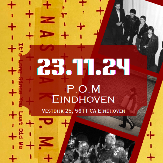
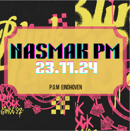
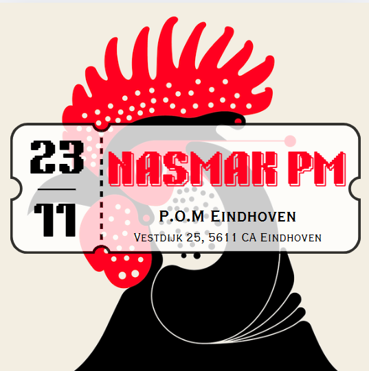
In the development project, my group member Miya and I created a website for the band Nasmak and their Dance Night event.

I started by researching how such a website should look and what key elements we needed, like a section for buying tickets, countdown and etc.
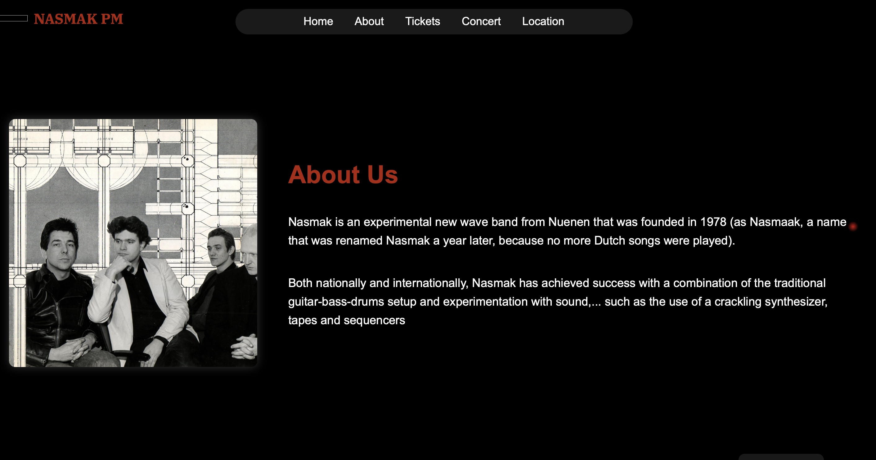
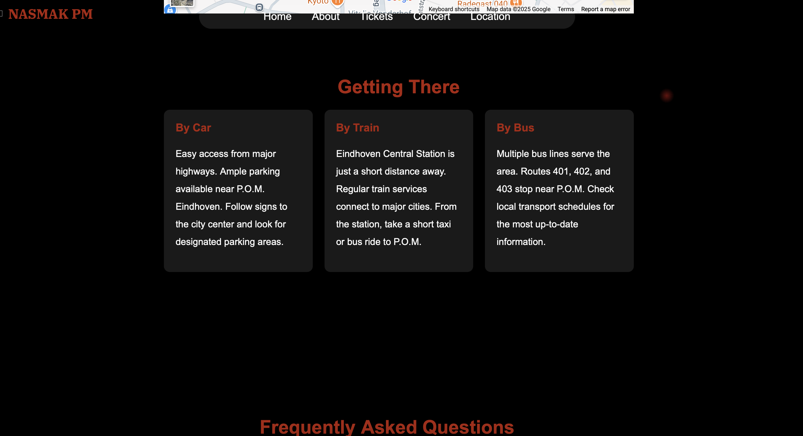
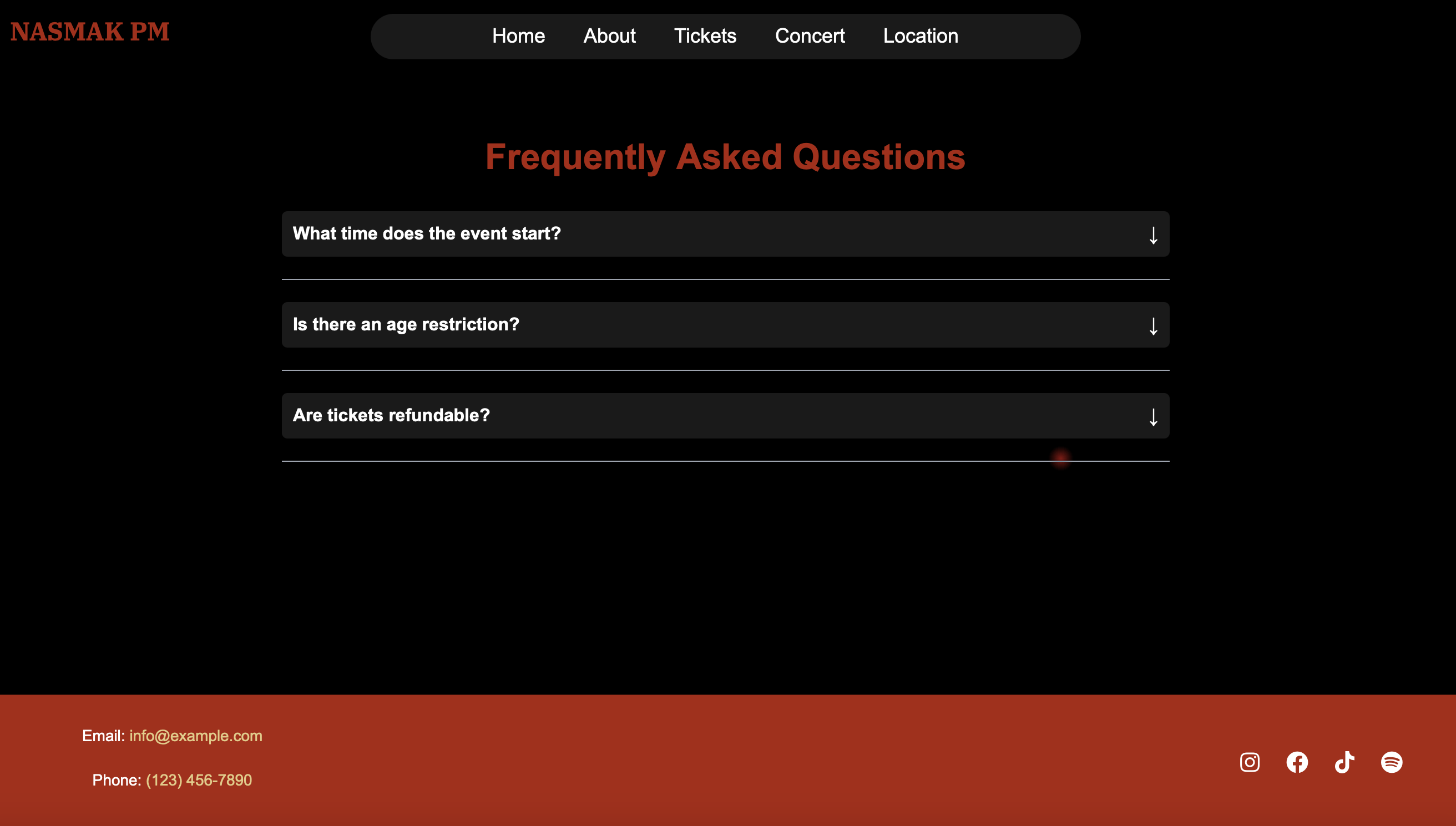
We split up the work easily since there were only 8 pages to build. I worked on 4 of those pages - About Us section, Getting There Section, FAQ's section and Blender. I did some research and asked ChatGPT to figure out what kind of questions should be included in the FAQ's section, and visited other similar websites to get insparetion.

The biggest challenge for me was working with Blender since it was my first time using it. It was tough at first, but as I kept practicing, I started getting the hang of it. I watched a couple of YouTube videos, but stuck to one in particular - here. I wasn't able to add Blender content to the ‘About the Band’ page yet, but that's something I’m working on figuring out now.

Once the pages were done, I did a user test where I had two people scroll through the site and give me feedback.
One of the main things they pointed out was that some elements, like the countdown, were in the wrong order.
For example, it would work better if the countdown came after the introduction.

Through this project, I learned a lot about using Blender, JavaScript, and even picked up a few coding tricks along the way. It was a great hands-on experience that helped me grow in both design and development.