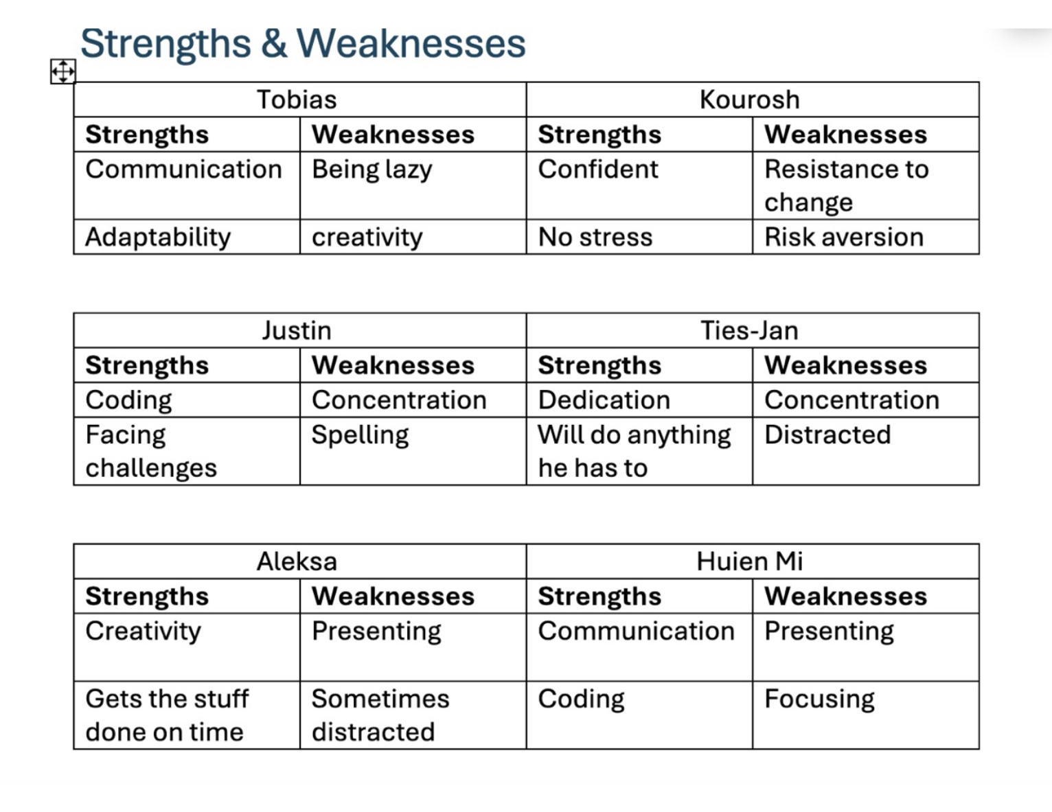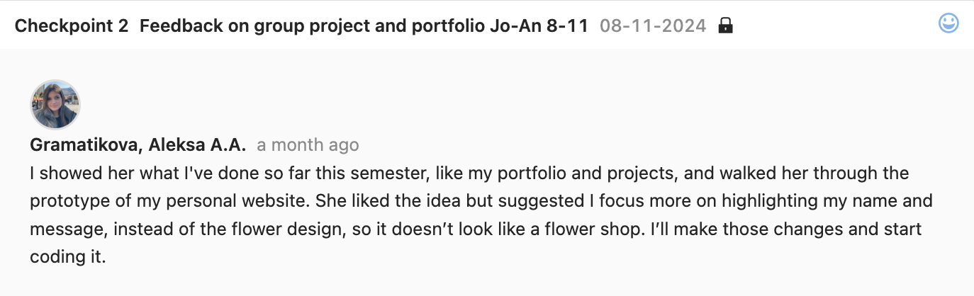
I did a user test on my portfolio with my teacher Jo-An and two other people from my oil.
Jo-An gave me some helpful feedback. She liked my portfolio idea but suggested I make my name and message stand out more instead of the flower design, which made it feel like a flower shop.
So, I decided to simplify the design and blur some elements to keep the focus on my name and message.
The first person that i user tested with, told me that the nav bar was missing something and it could really use a design or some type of interaction.
He couldn’t give me a specific idea in mind, but I came up with a vision that when the nav bar is hovered over it glows.
I tried with multiple colors and thickness but I ended up sticking with a simple white thin glow.
The second person told me that an “about the portfolio” would be very useful.
I added it after the “about me” section, I explained what all the element in my website mean to me. I saw it as an introduction to my portfolio.